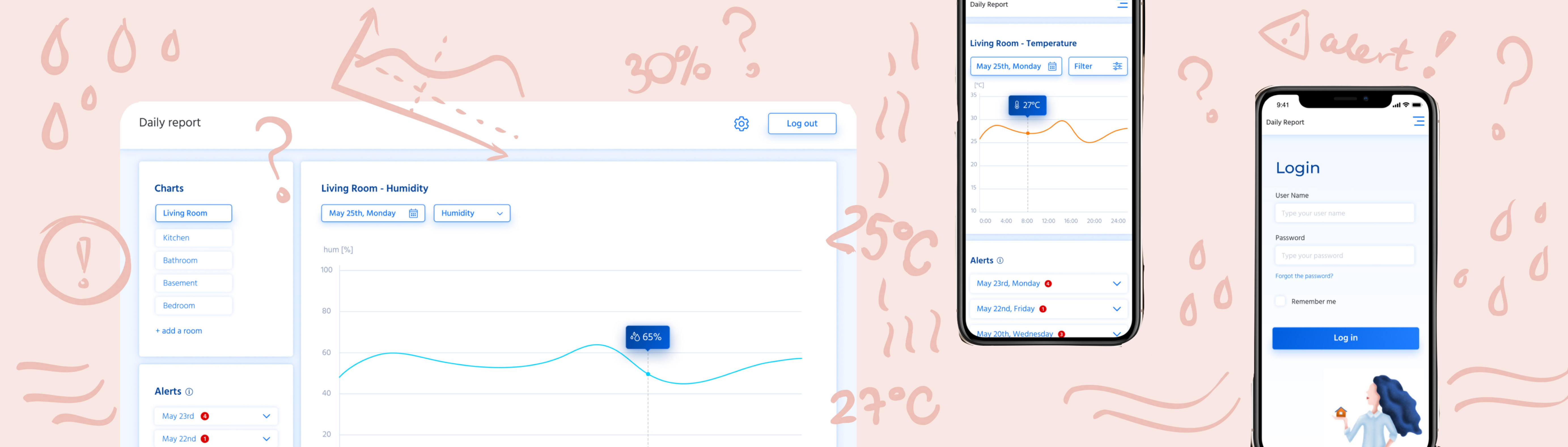
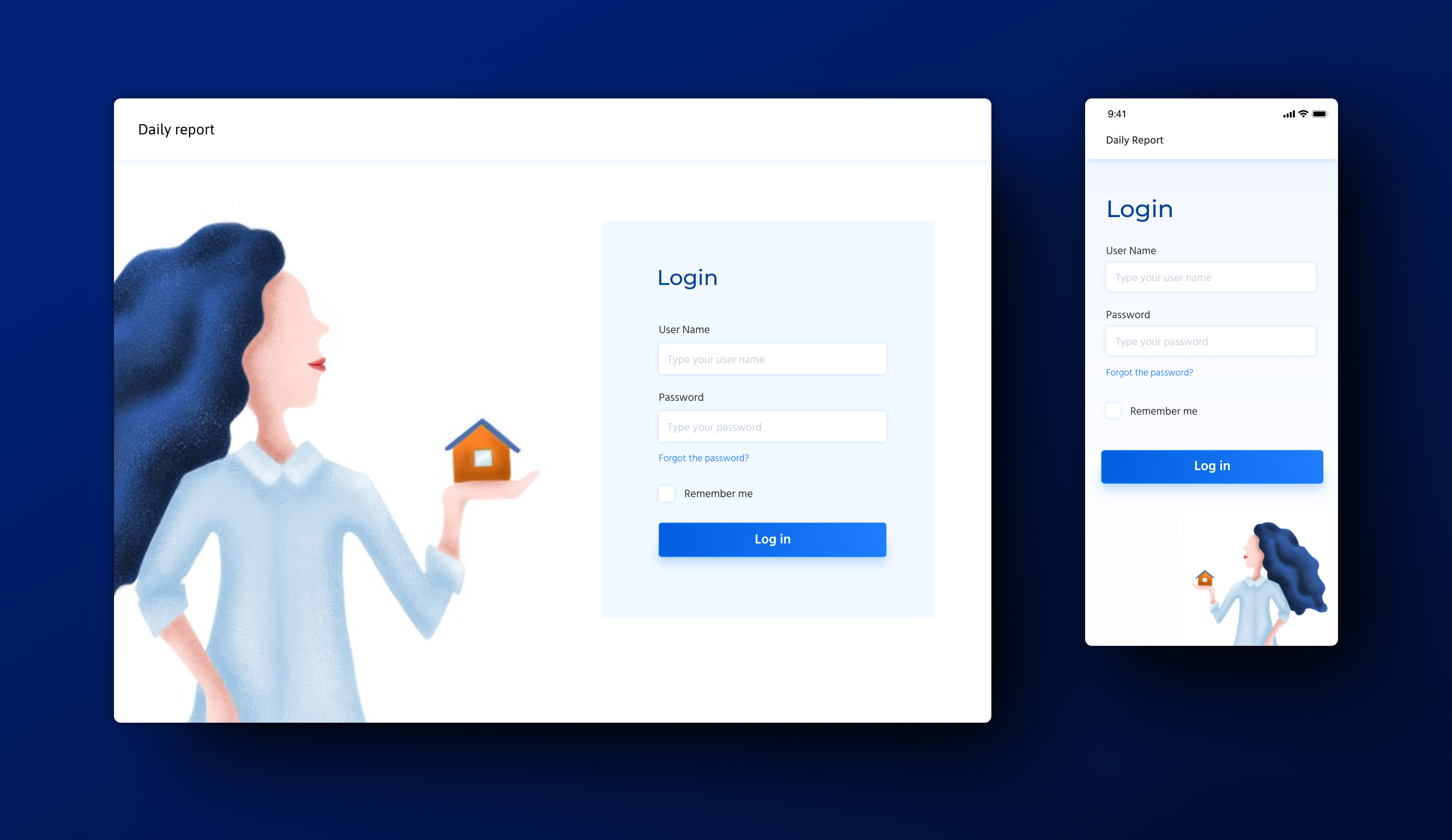
Daily Report - Dashboard
the IOT application that shows the room's conditions measured with the Raspberry Pi sensors
In Japan, due to the humid and warm climate, I am increasingly confronted with the problem of a mould in my home.
I don’t have the ability to monitor the humidity level and temperature in the apartment.
The project was created by me (concept, UX and UI design) and my husband Damian (development and technology).
Mould in rooms has a negative impact on health (causes breathing problems, increases allergies). Therefore, it is very important to prevent its formation, e.g. by monitoring the temperature and humidity level in the apartment.
Unfavorable room's conditions are the cause of discomfort and lower concentration. Based on Comfort Zone chart by Leusden and Freymark one can assume that the best room conditions are for temperature 19-24°C and humidity 40-70% (for mold prevention the lower the better).
When I know the actual values of temeperature and humidity I can easily change air conditioning settings or install devices that absorb moisture from the air.
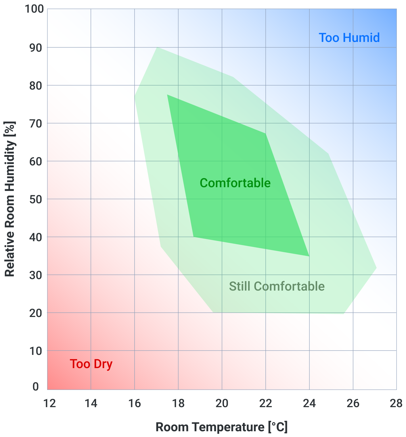
Pic. 1. Comfort zone by Leusden and Freymark
We decided to use the Raspberry Pi technology, which allows to build devices based on ready-made sensors (including temperature and humidity sensors).
We chose the Sense HAT. It has an 8×8 RGB LED matrix, a five-button joystick and includes the following sensors:
Data flow (simplified schema, based on MERN Stack):
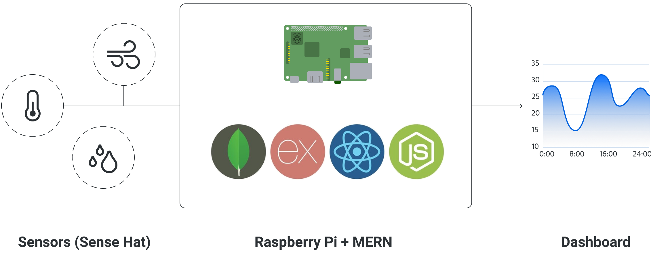
Pic. 2. Application schema

I made a competitor analysis to find out what are the best practices for dashboard design. I also identified the main objectives of the application.
Based on this, I have defined the main functionalities for dashboard:
Initially, the application was supposed to display all three charts for each room separately on one screen, however, a large part of the content would be below the fold.
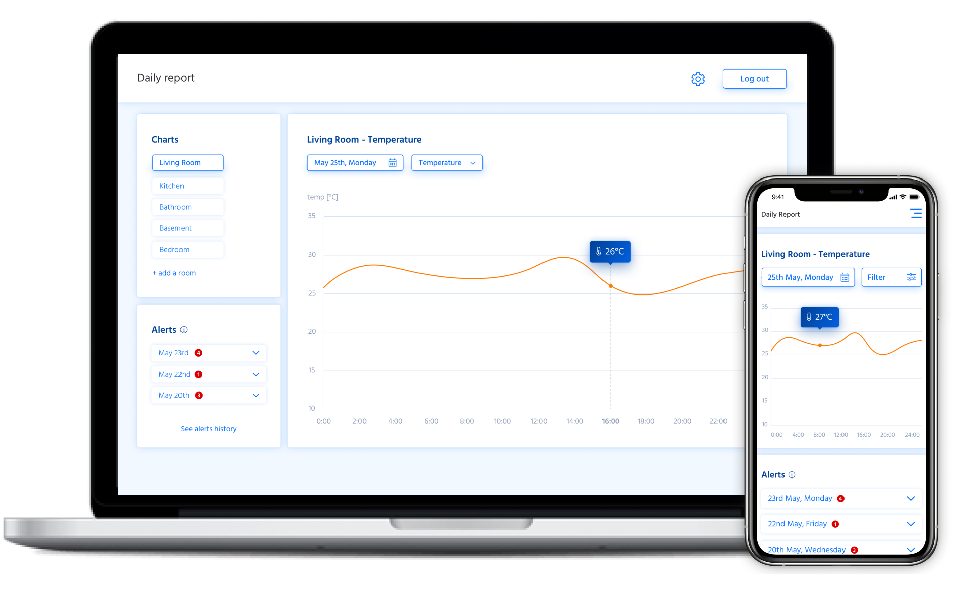
In the final version, only one chart is visible on the dashboard, on which the user can focus.
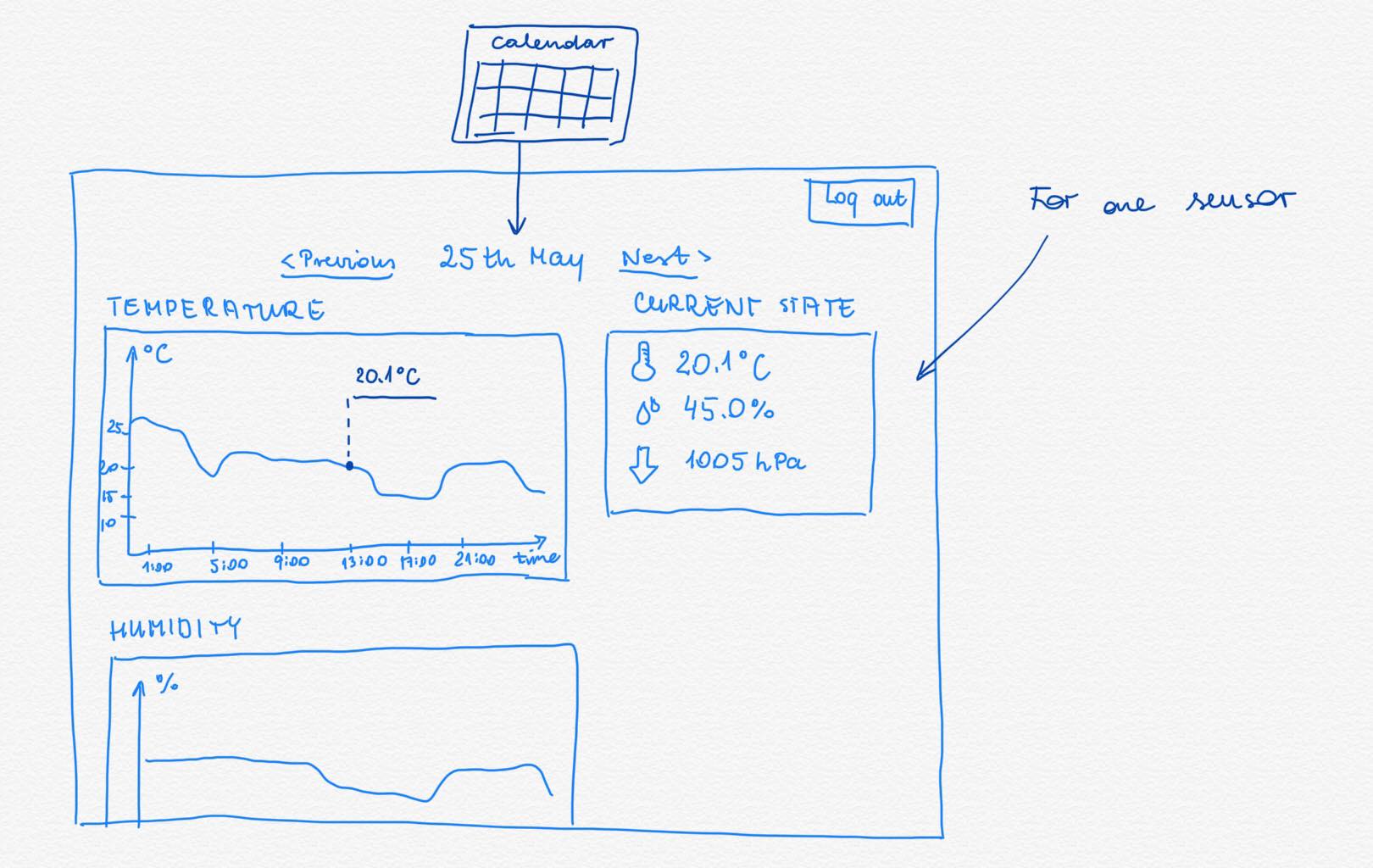
Pic. 3. Early sketches

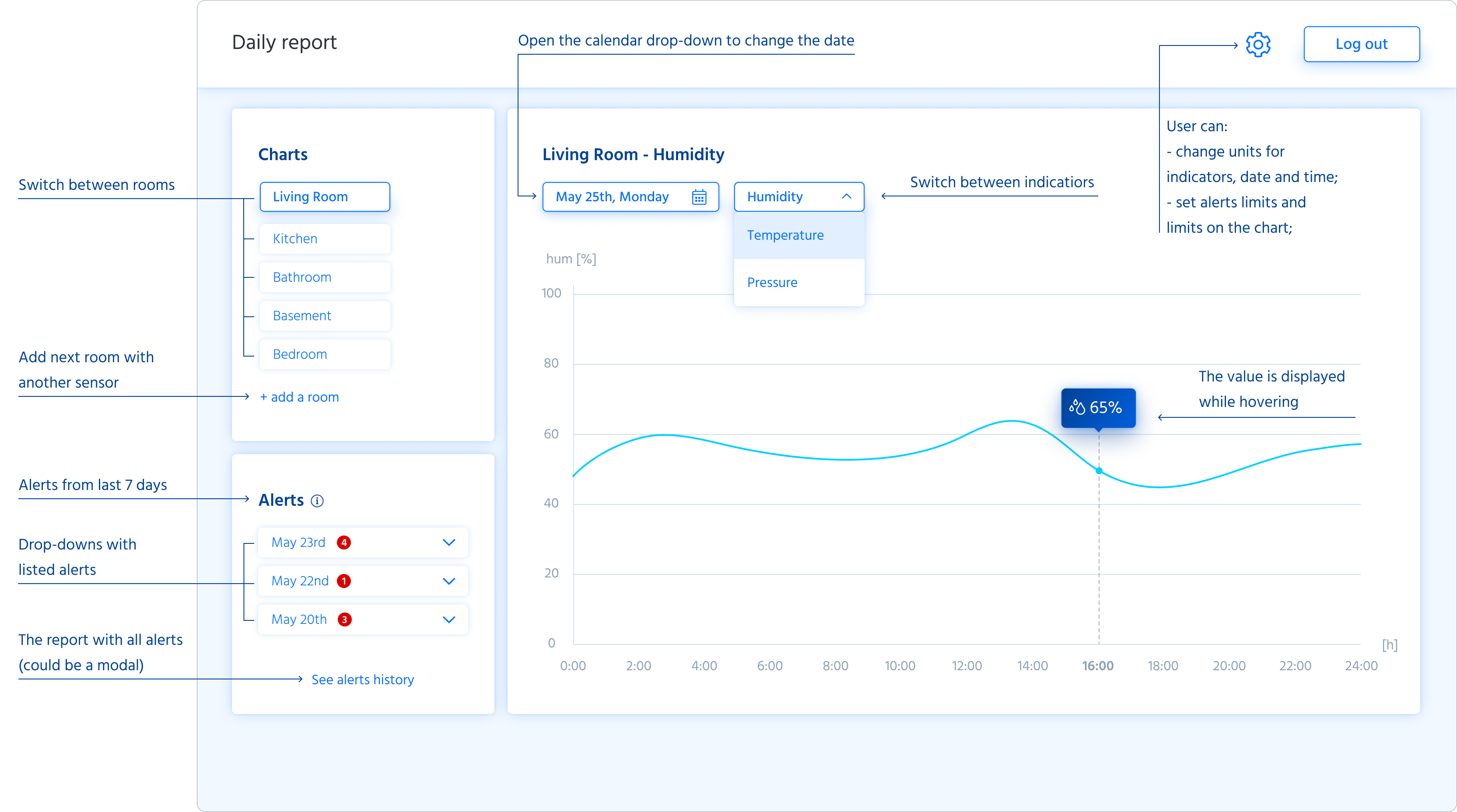
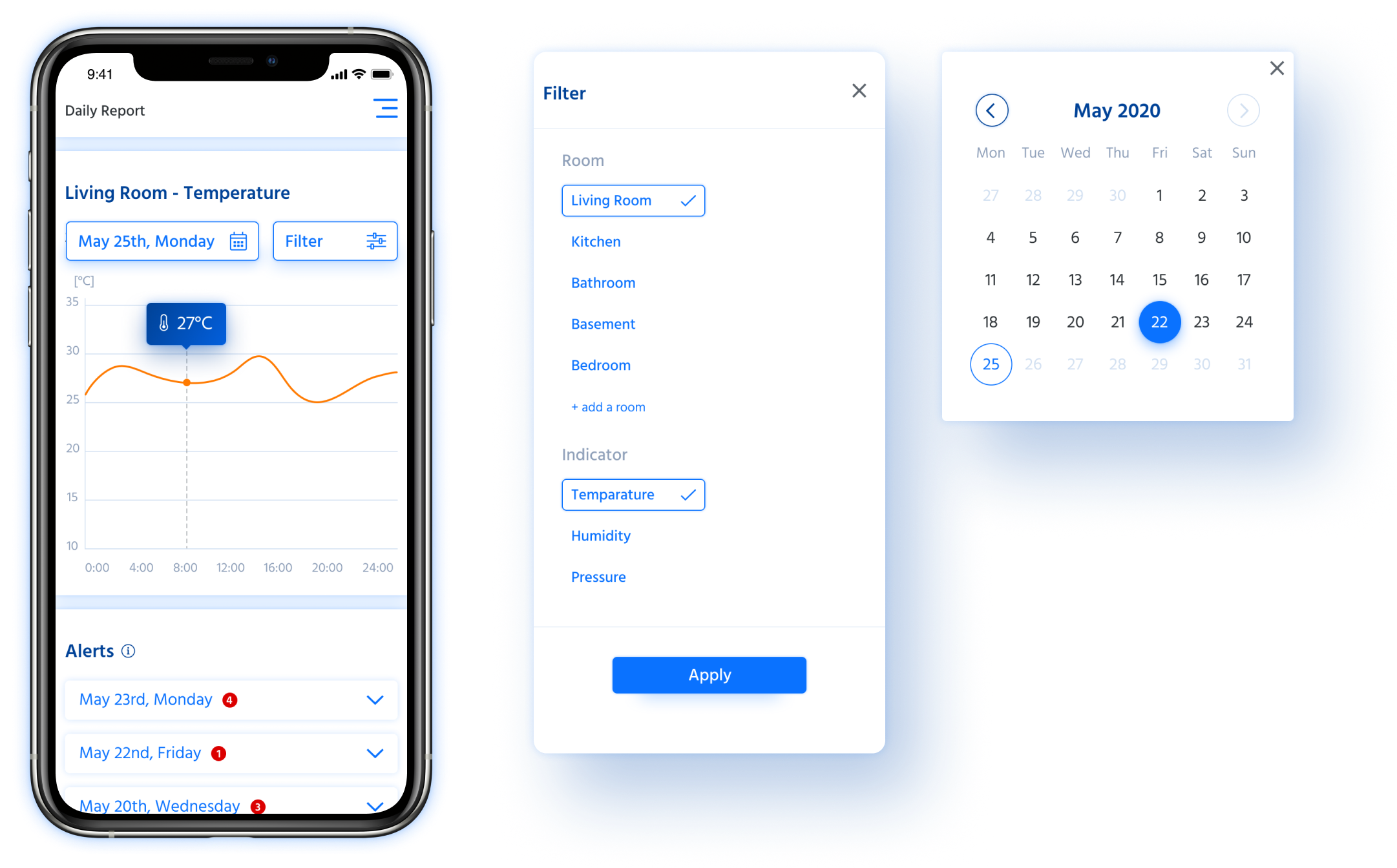
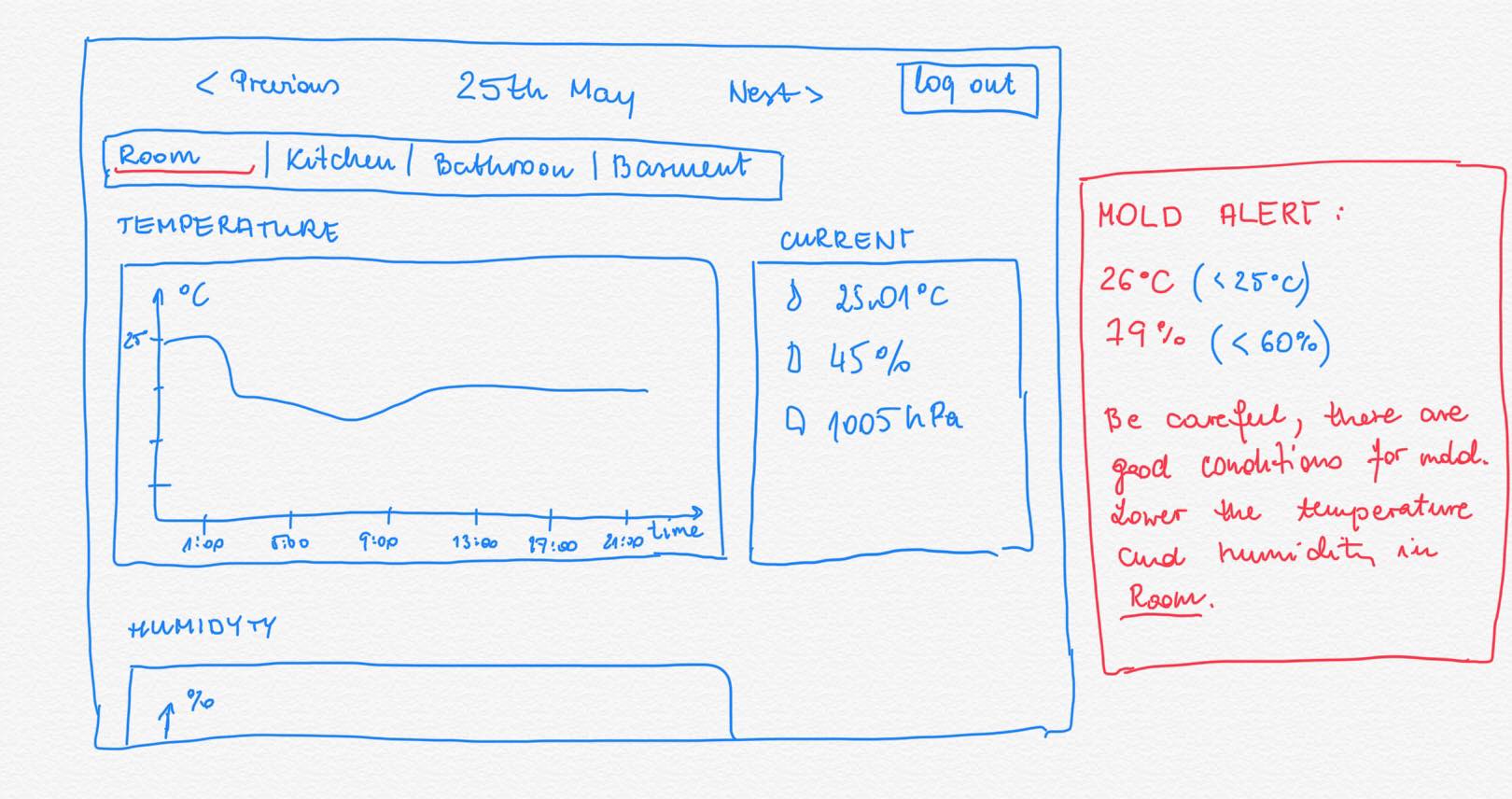
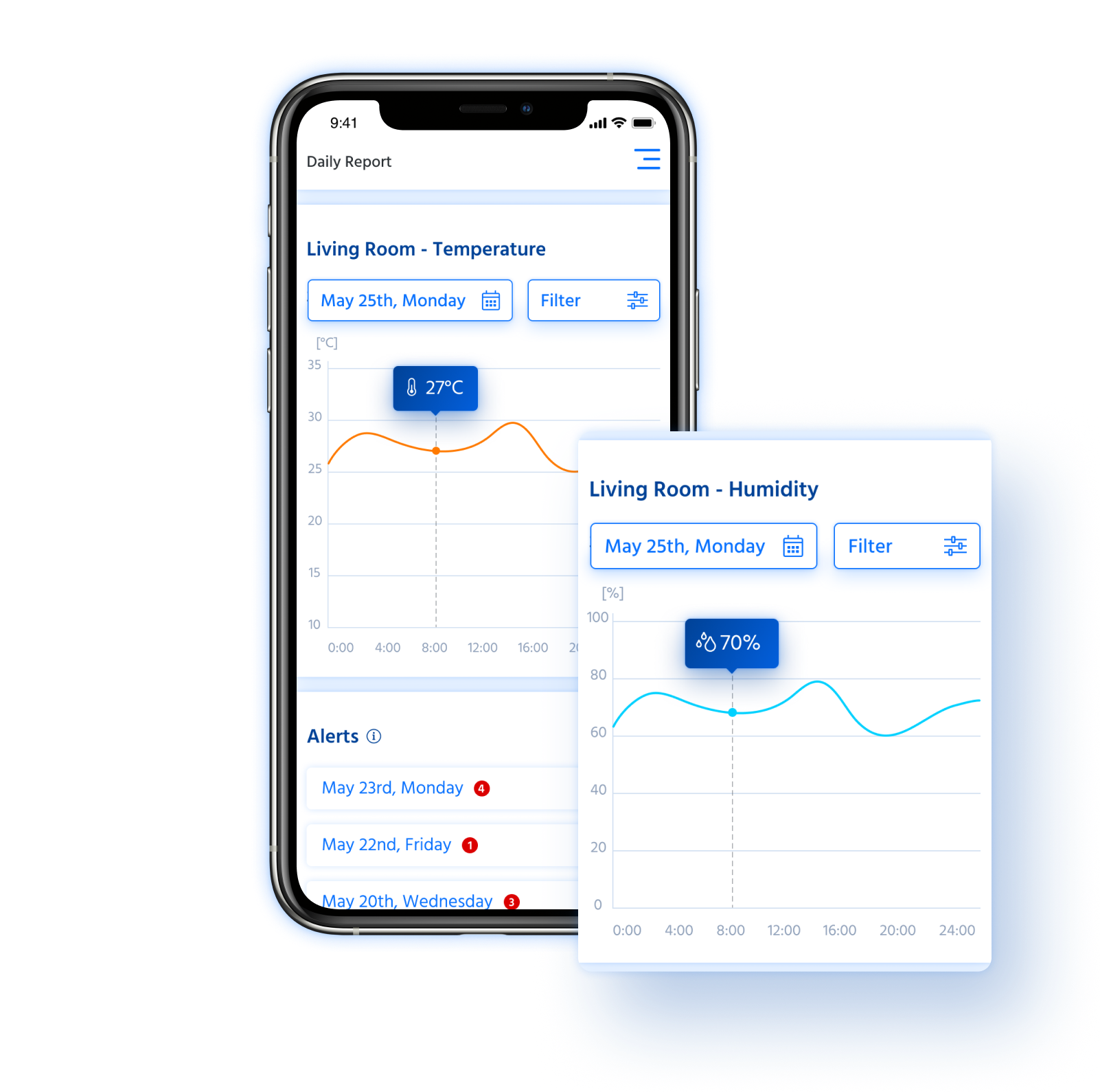
Filters - same as on the desktop, users can filter content by date, indicators and rooms. Results are displayed on the chart. Users can see particular value for an hour by pressing on specific area on the chart.
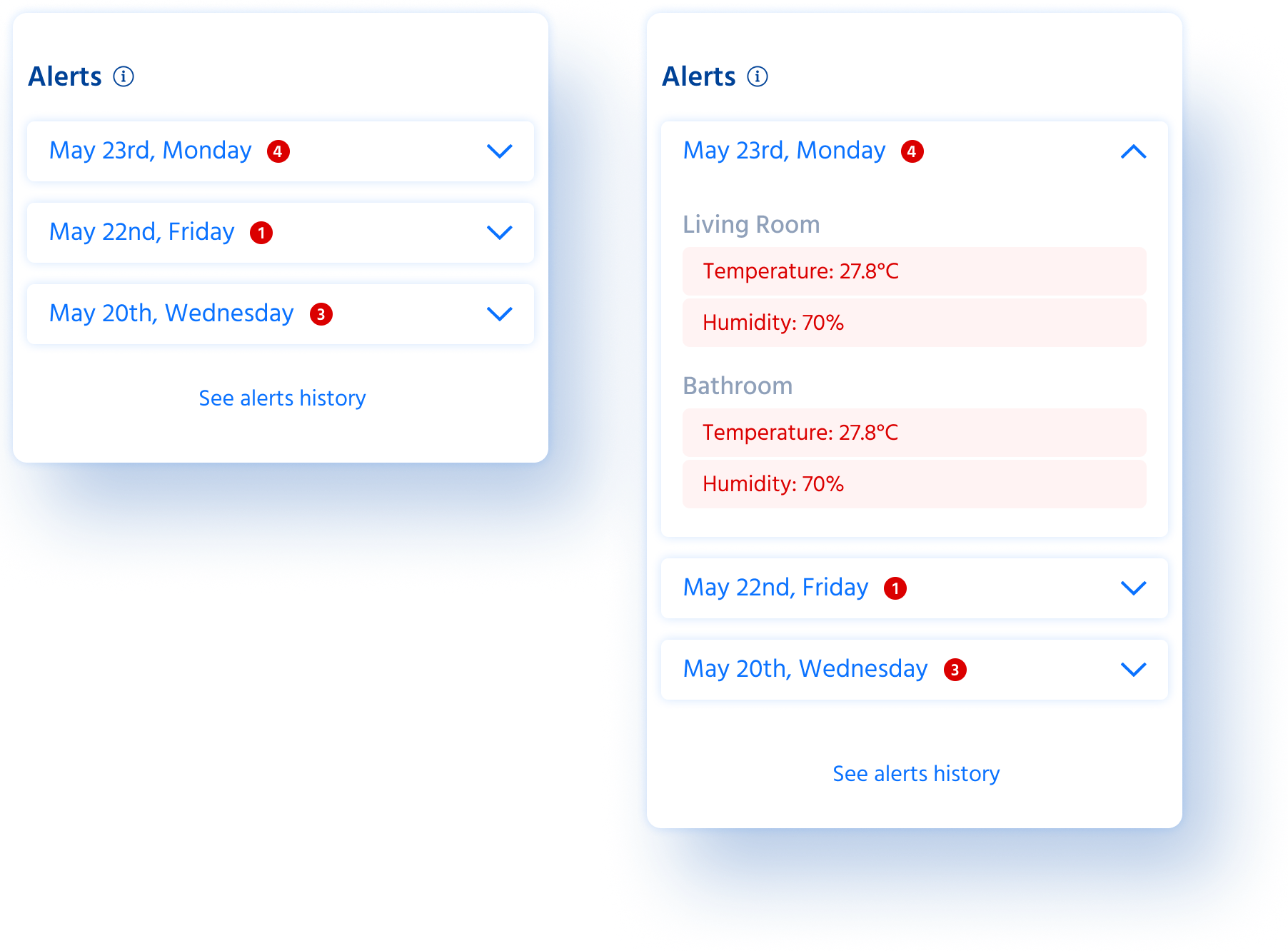
Alerts - to quick detect whether the temperature and humidity limits have been exceeded. When the drop-down list is expanded, the user can check exactly what the alarm is about, after clicking on the label the corresponding chart appears on the dashboard.
We published MVP version of the interface and even in this form it helps us a lot in our daily life.