
DISCOVERY
Interviews
In order to diagnose problems with shopping I conducted 5 interviews, 1 direct observation and 4 diary studies (the respondents are 26 - 32 years old, living in large and mid-sized cities, come from Poland).
I wanted to recognize the following issues related to shopping:
- standard style and habits and tools used in regular and online shopping,
- motivation for choosing products,
- attitude to online shopping,
- frustrations and difficulties, as well as sources of satisfaction during shopping,
- attitude to sustainability issues in the context of shopping,
Data Structuring
I used the Affinity Diagram method for data organization. I wrote down the frustrations, needs, thoughts and any important information I was able to draw from the interviews and observations.
After a few iterations I grouped them into the following categories:
- product price & quality
- product evaluation & review
- food amount estimation
- product availability
- product details
- shopping style
- shopping tools
- sustainability
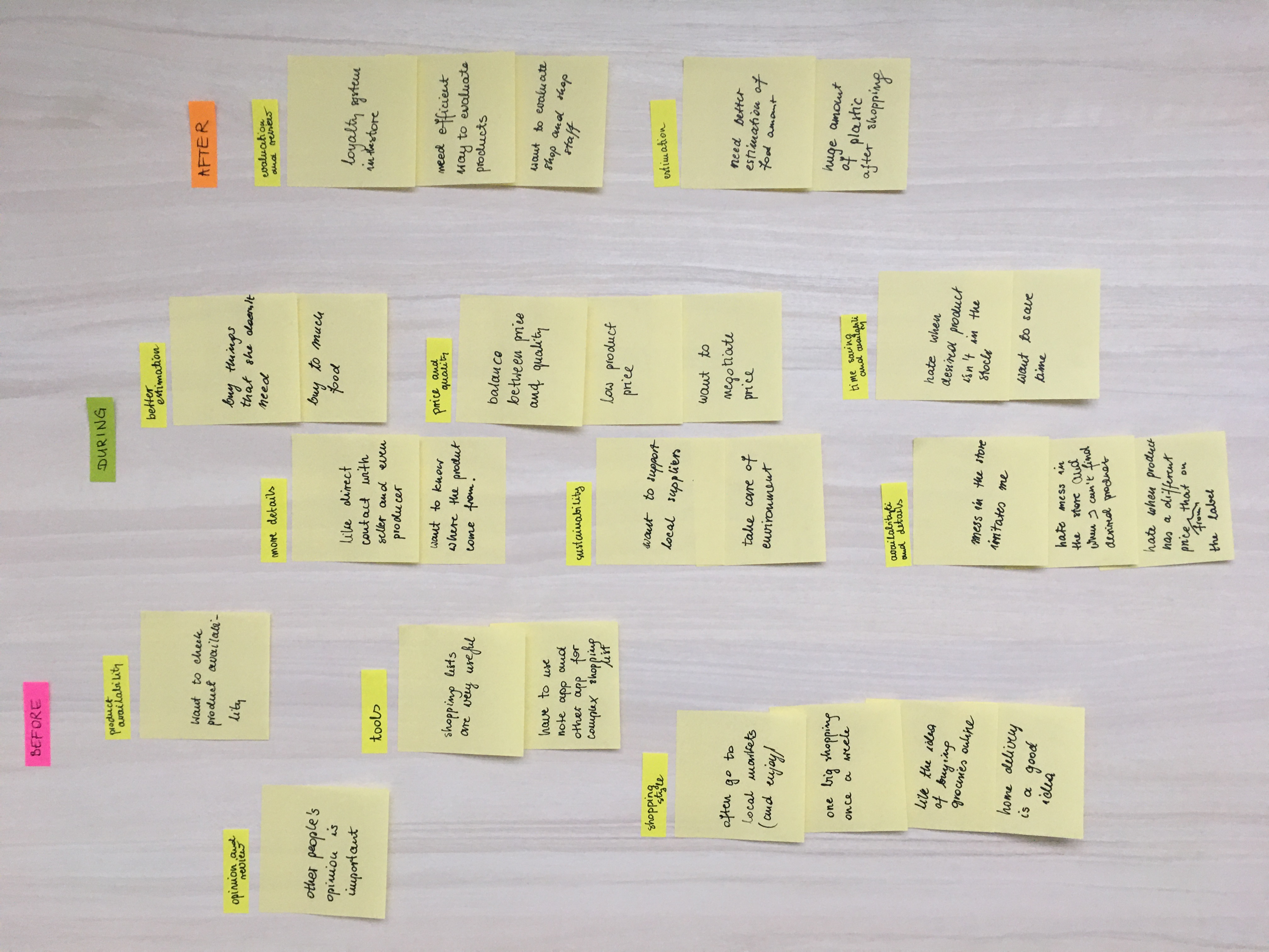
Affinity diagram - second iteration
Defining Problems
In each of the categories, I have identified the problems and issues most important for respondents.
I wanted to think about what they are doing while shopping and why are they doing it, and what makes them feel frustration or satisfaction. This reflection helped me to think about potential solutions to their problems
| What users do or feel? | Why? | What users need? |
|---|---|---|
| users find shopping list helpful | shopping list helps saving time during shopping and better estimate the food amount | better product amount estimation, time saving |
| when making a shopping list users have to switching from one app to another or using both an app and a paper list | tools aren’t efficient enough (e.g. an app with automatic shopping list based on recipes but without a possibility to add products which aren’t in the recipe) | one tool and efficient tool |
| after shopping user feels frustration because of paying more than he/she thought | lack of product details, or a wrong information on the label | trustworthy information about products |
| before shopping users are searching for other users/customers opinion | user wants to buy a trusted product and don’t waste money | trustworthy information about products |
| after shopping user evaluates producers | user wants to express dissatisfaction and avoid such a situation in the future | evaluation & review option |
| users are making shopping once a week | users want to save time (and avoid going for shopping severals times a week) | time saving |
| users prefer shopping on local markets | they can ask the seller for product details | trustworthy information about products |
| afters shopping users are frustrated because of the huge amount of plastic packaging | they want to be more eco-friendly and produce less waste, they are environmentally aware | solution for reducing plastic amount |
User Journey Map
The next stage was to create User Journey Map in order to visualise the issue and identification of pain points.
Anna's journey in making Saturday's shopping
Anna would like to do her weekly shopping as fast as it's possible. She is an overworked person so she often takes advantage of the opportunity to buy online, but in her city she can’t buy food online.
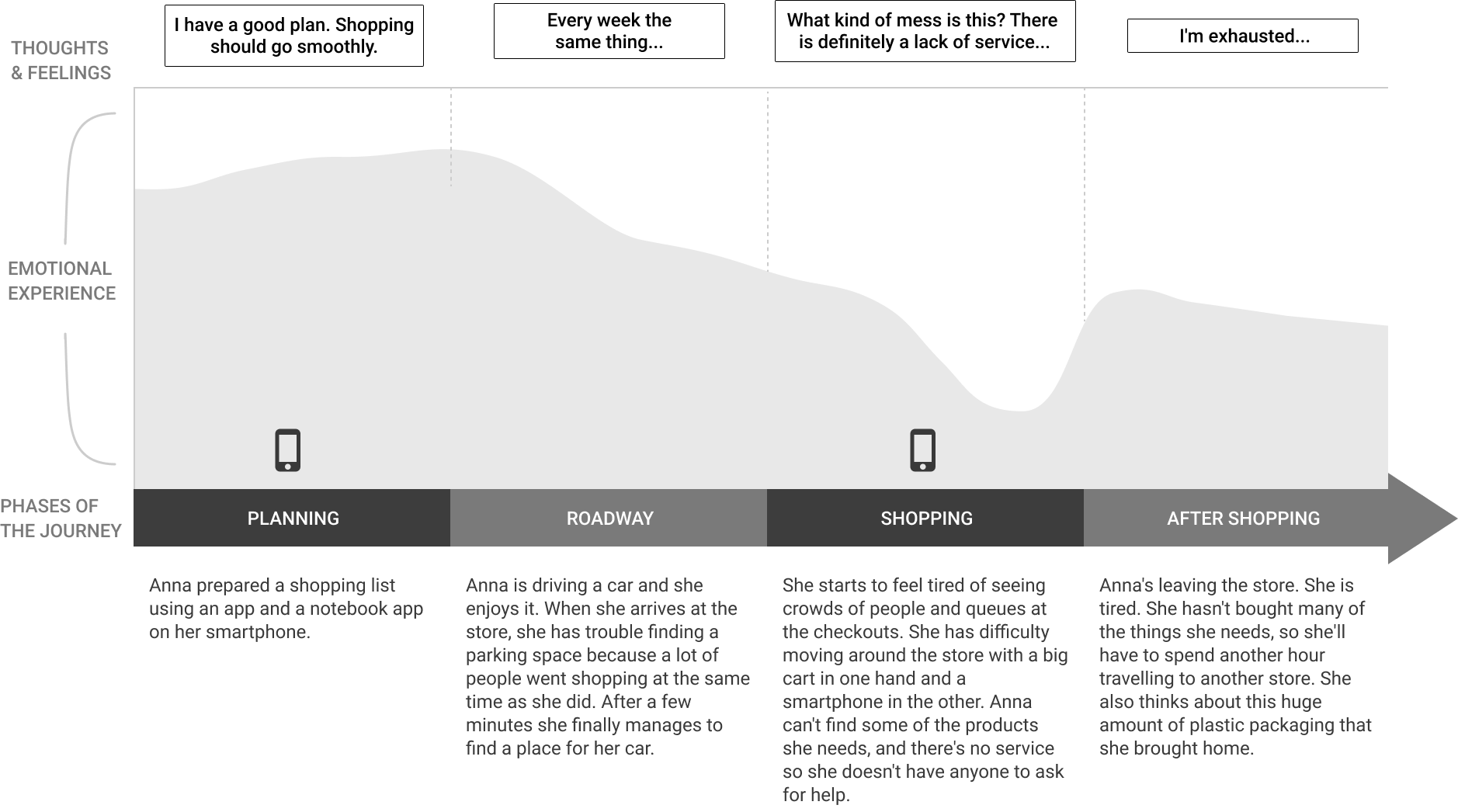
Journey map
Problems & Point of View
Based on the previous analysis, I have formulated a general point of view which will be the starting point for further work.
Possibility to buy fresh and healthy products from trusted, local suppliers in the big city.
I identified main problems and their possible solutions.
| Problem | Solution |
|---|---|
| lack of product information | detailed information, possibility of contact with the producer, ratings and recommendations |
| search for products with better prices | notifications about sales and best prices |
| too much plastic packaging | the possibility to choose eco packaging |
| long queues in stores, mess in the store, no parking spaces available |
simple grocery shopping through a mobile application |

DESIGN
Paper prototypes
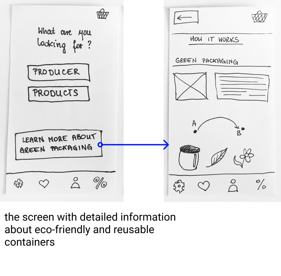
Heuristic Evaluation
I asked two people to use early paper prototype. Based on observations, their comments and Jakob Nielsen’s 10 heuristics
I evaluated the paper prototype.
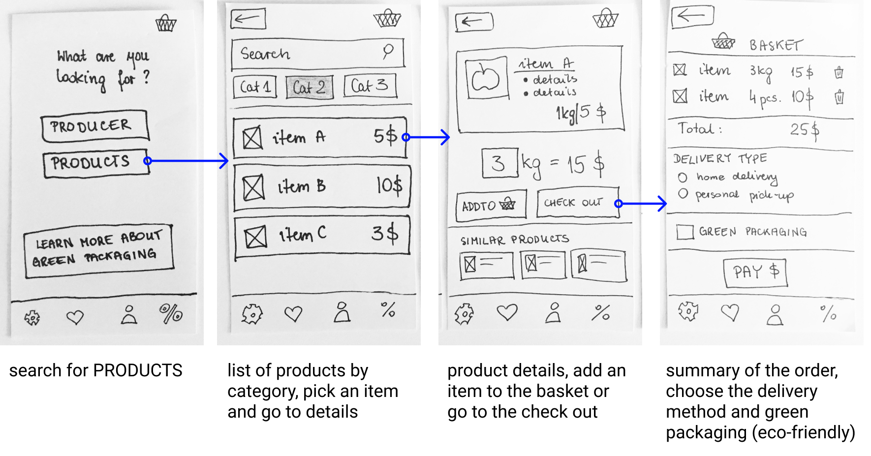
I've made improvements to the prototype and created a general user flow for app. After that I made a low-fidelity prototype in Figma.
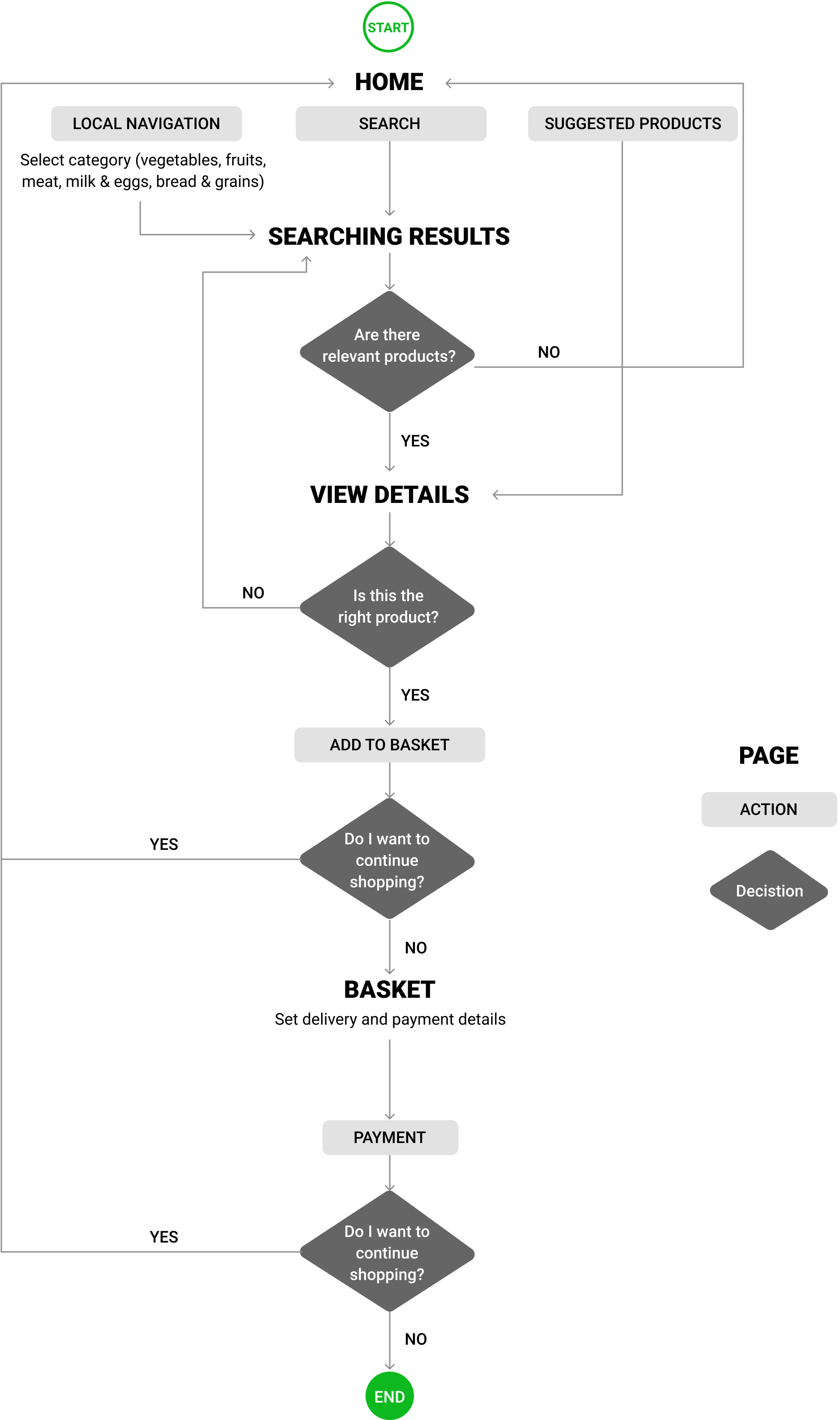
User Flow
Low-Fidelity Prototype
User Testing
The application was tested by 5 users (the tests were recorded for later analysis). Based on observations I've made necessary improvements to the app interface.

RESULTS
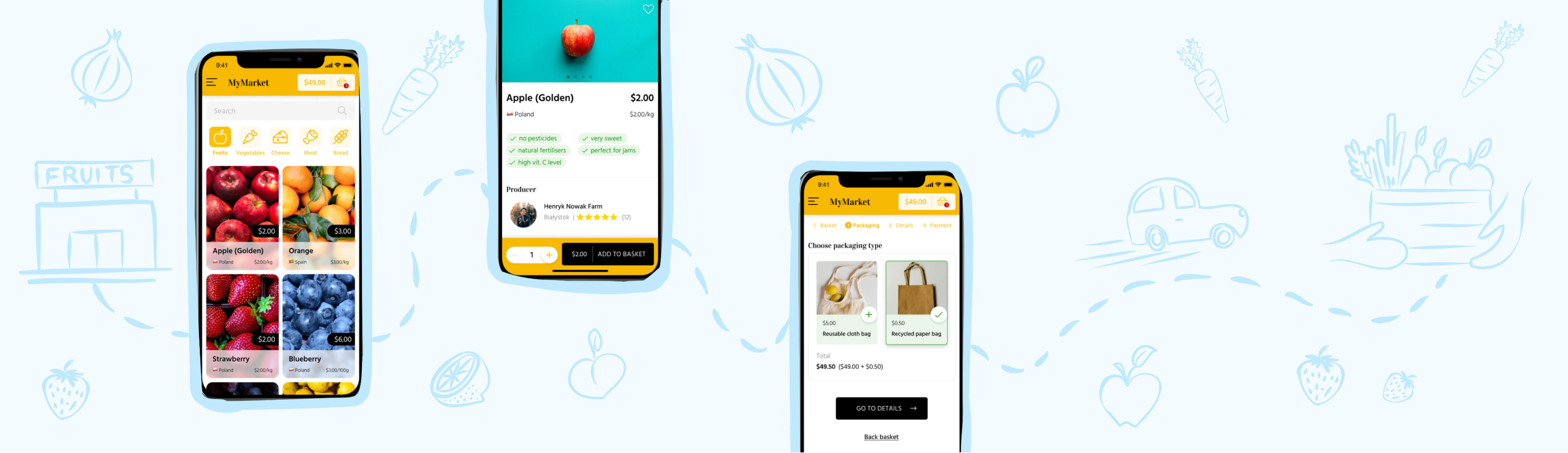
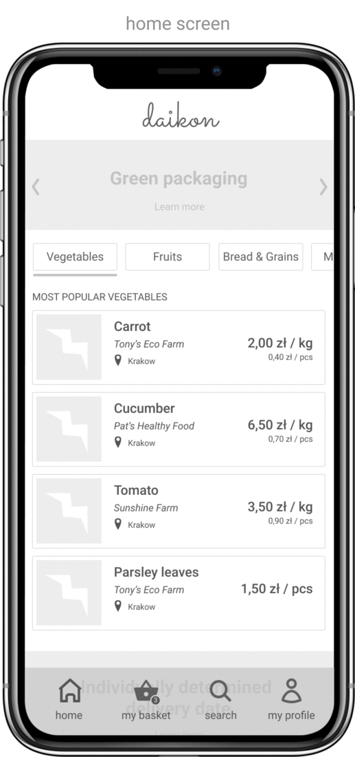
Home Screen & Menu
I wanted the main screen of the application to be clear and correspond to the main purposes of the application (searching and buying products). That's why I decided to hide second order options (settings, notifications, profile, favorites list) in the side menu.
The user has the possibility to search for products by name, but in a simple way user can go directly to the categories of products (fruits, vegetables, cheese, meat, bread).
From this level user can also see the content of the basket together with its value.
Home screen, fruit category view and side menu
Product Screen
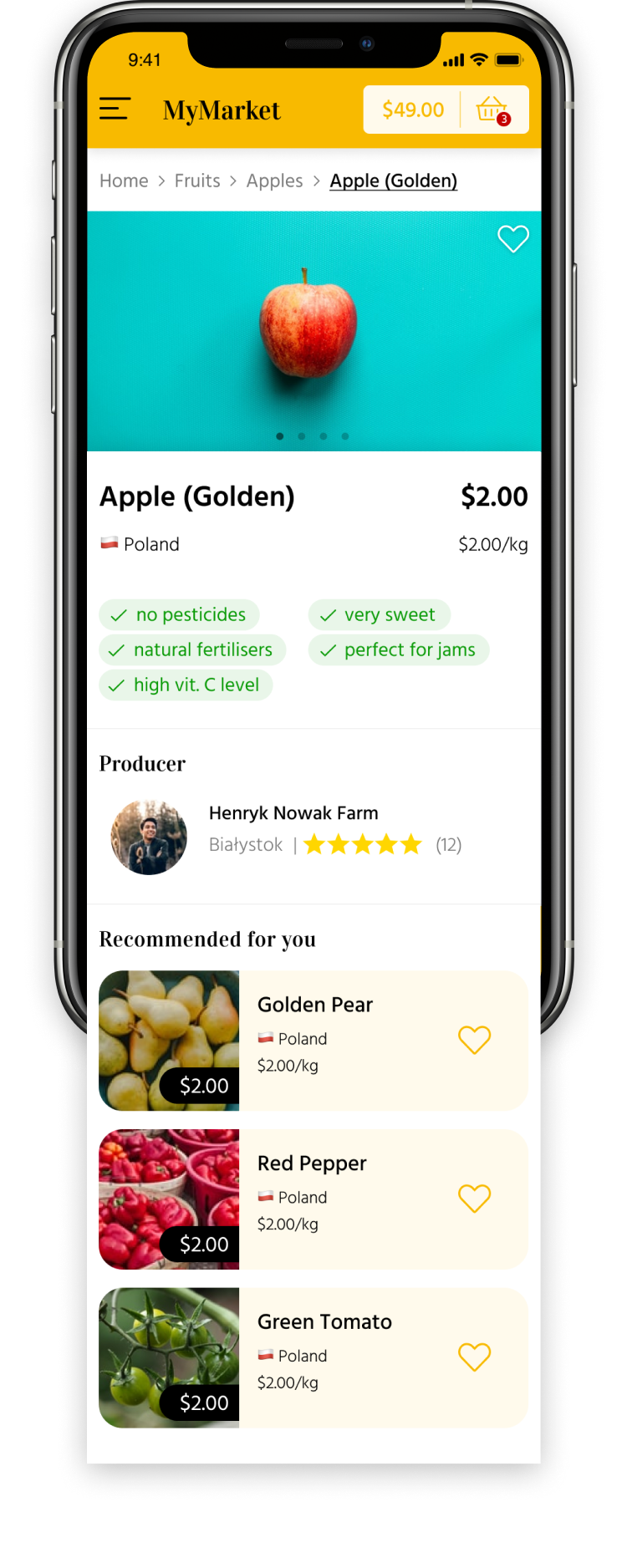
Product Screen
In addition to basic information (name, price, country of origin, photos), there is a clear list of data on the production method, use and characteristics of the product.
User can also see basic data about the producer together with his/her evaluation and other products recommended for the user (these can be products bought by people who were interested in the main product).
The heart icon allows to add products to the favourites list (available in the side menu).
Product out of Stock
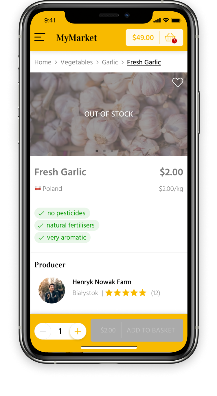
Product out of stock
When the product is out of stock, user can still view the data about it and can add it to favourites (user will be informed when the product is available).
However, its unavailability is clearly marked (the picture is dimmed, it is shown on the sign of unavailability, the "add to basket" button is disabled).
Packaging Type
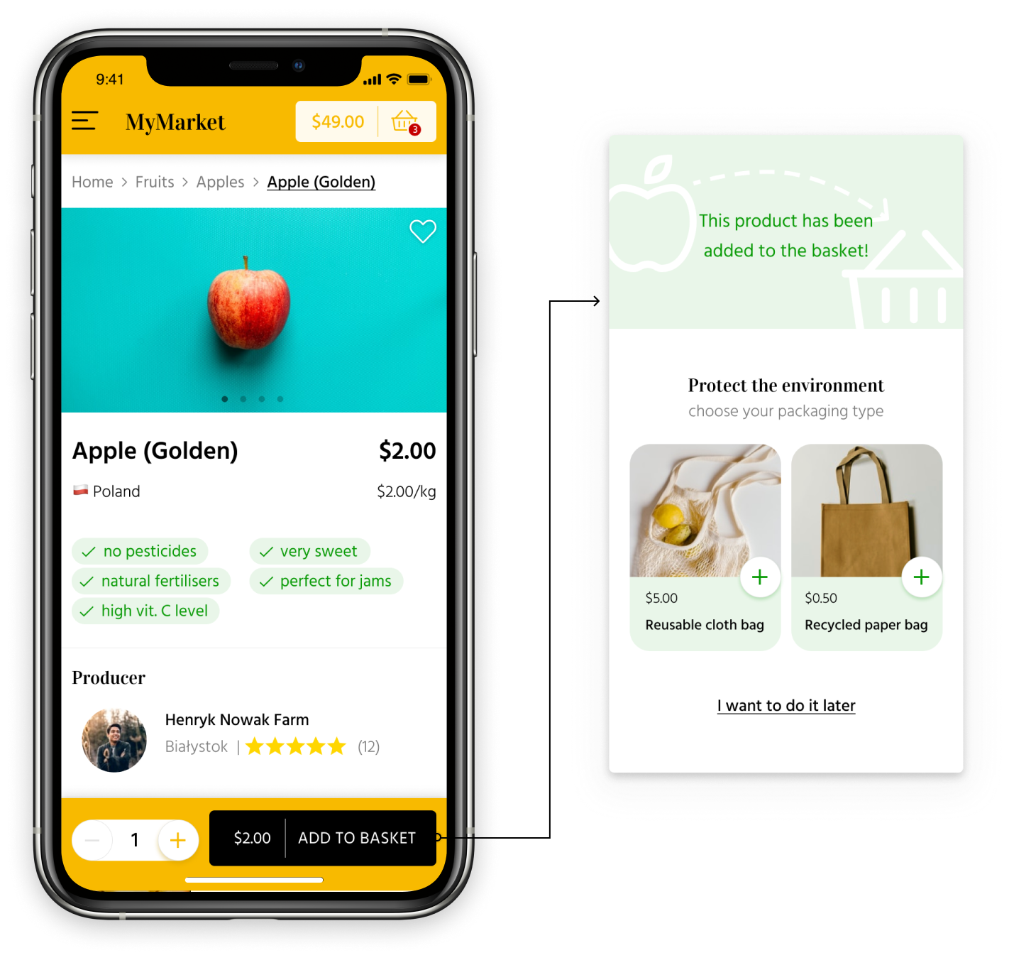
Adding to the basket and packaging type
The button “add for basket” and changing the number of products is placed at the bottom of the screen (fixed). After clicking "add to the basket", an overlay is displayed with information about the successful course of action and the possibility to choose the type of ecological packaging (which meets the expectations of respondents). The user can postpone this decision to another moment.
Check out
I split check out process into 4 clear steps:
- Basket (list of products with possibility of editing);
- Packaging (user can choose ecological packaging type or simply change it if it was chosen previously);
- Details (recipient’s data (A) and delivery date (B));
- Payment (order summary, payment method and confirmaton).
It is easier for user to focus on one thing each time rather than filling very long and complex form. It helps user to make decisions faster and prevent from possible errors. Main part of the screen is above the fold so user will avoid the possibility of missing important information when purchasing.
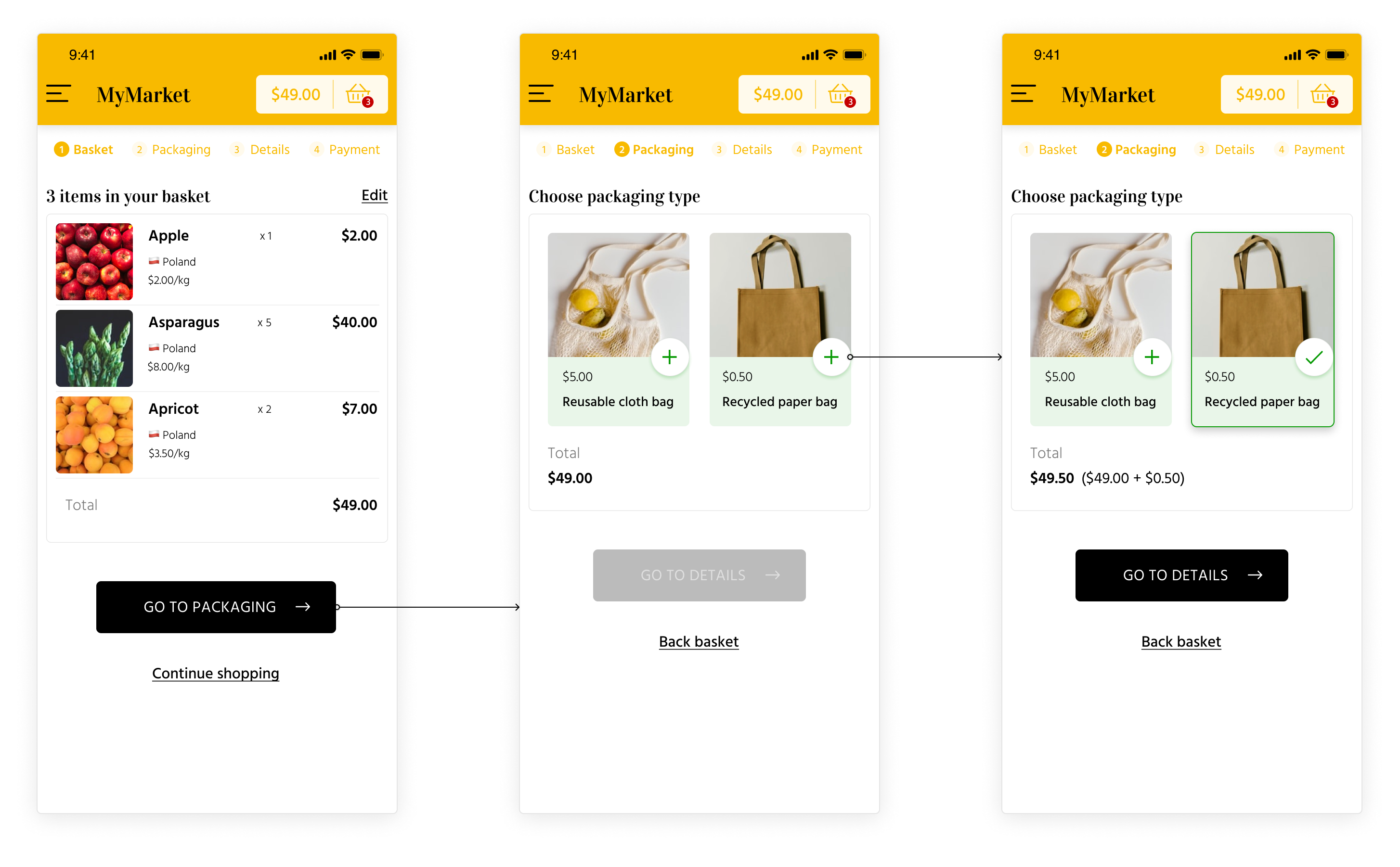
Basket and packaging type
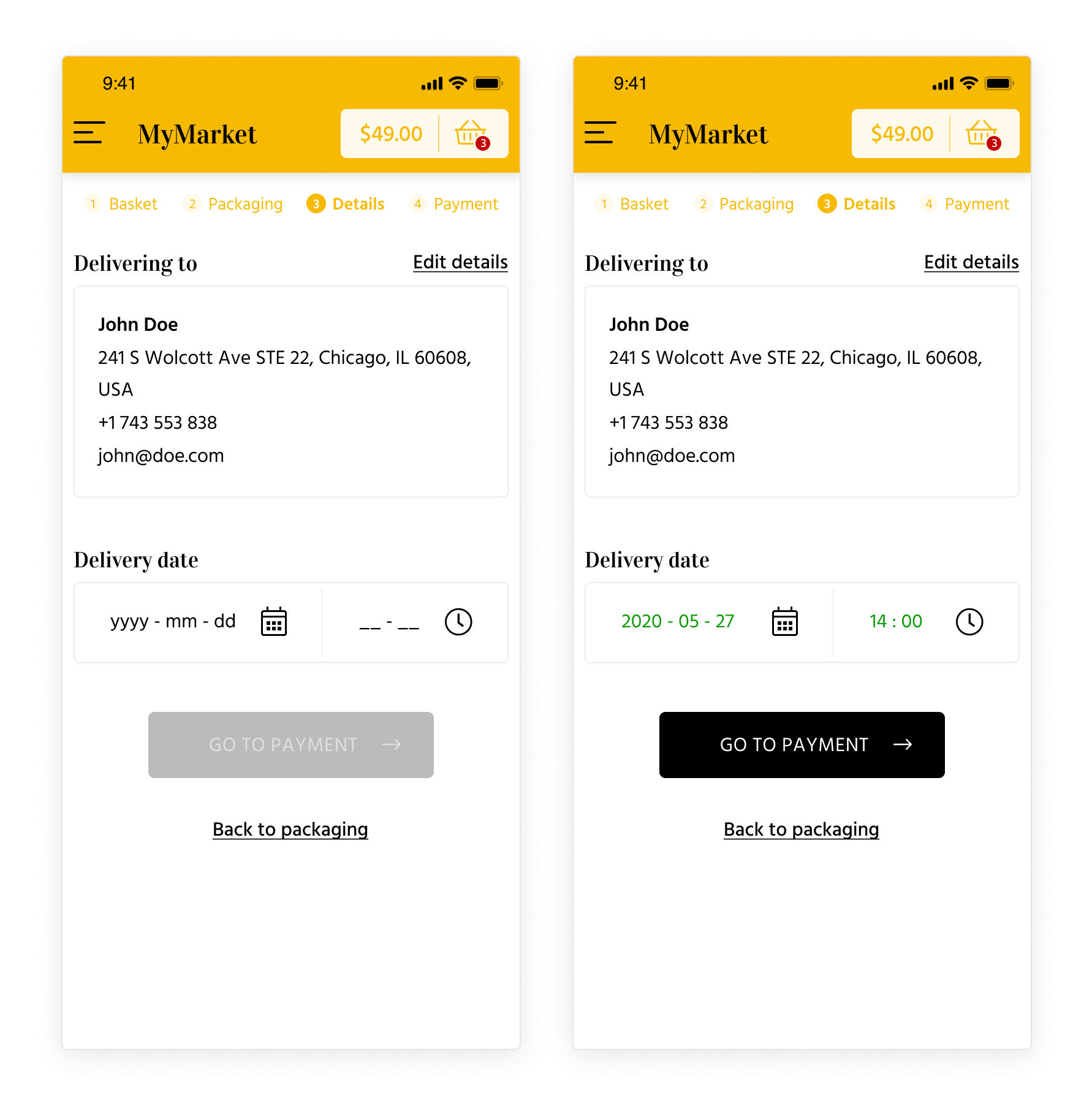
Delivery details (unedited and edited)
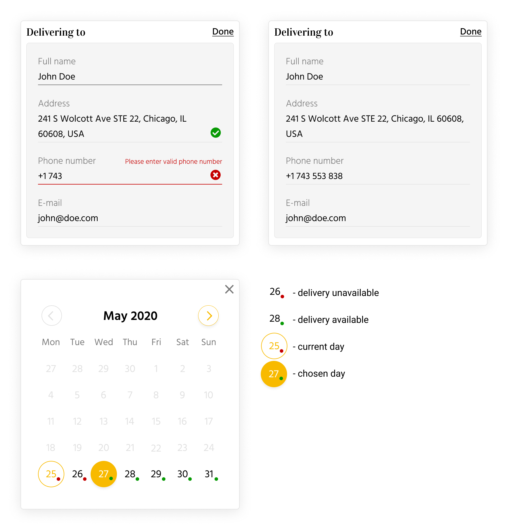
Recipient's data editing and calendar with symbols description
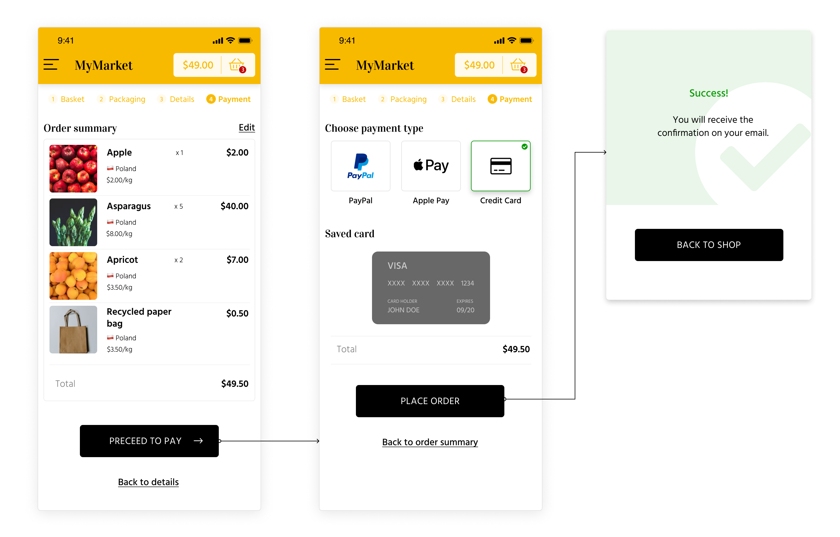
Payment and confirmation
SUMMARY
This is one of my first complex projects which I made as part of Interaction Design Specialization at UC San Diego. The MyMarket app is a prototype, so unfortunately I don't have the ability to collect data from users and improve their experience while using it.